Our Library
Below are some of the fonts currently available in the Hibu library. Some contain various weights and/or italic versions.
Sans Serif
Suitable for use as headlines or default copy.
Alef Hebrew Amaranth
Amiko
Arial
Cabin
Droid Sans
Duru Sans
Exo
Exo 2
Gudea
Helvetica
Josefin Sans
Lato
Maven Pro Montserrat
Open Sans Oxygen
PT Sans
Play
Puritan
Raleway
Roboto
Sans-serif
Signika
Source San Pro Spinnaker
Tahoma
Titillium Web
Ubuntu Mono Ubuntu
Verdana
Yanonne Kaffeesatz
Serif
Suitable for use as headlines or default copy
Alike
Cardo
Courier New
Crimson Text
Droid Serif
Georgia
Glegoo
Inconsolata
Libre Baskerville
Lora
Lusitana
Mate SC
Merriweather
Old Standard
PT Serif
Prociono
Quattrocento
Vollkorn
Display
Use for headlines only
The following fonts have good readability and are good choices for headlines
Abril Fatface Anton
Cairo
Cookie
Courgette
Dancing Script
Lobster
Lobster Two
Mogra
Monoton Oswald
Pacifico Paytone One Playball
Playfair Display
Poiret One Racing Sans Shrikhand
Teko
The following fonts have questionable readability and/or style -- use sparingly.
Allura
Amatic SC
Bad Script
Gloria Halleluja
Great Vibes
Indie Flower Permanent Marker Sacramento
Stalemate
Yesteryear
The following fonts should generally never be used in a Hibu website, unless you have a very unique customer who drinks blood.
Butcherman Creepster
Eater
Nosifer
Slap Serif
Use for headlines only
Alfa Slab One
Belgrano
Crete Round
Flamenco
Josefin Slab
Patua One
Roboto Slab
Rokkitt
Sanchez
Slabo
Readability
Use care in choosing fonts for the default (body) text of your websites. Sans serif fonts are the best choices for readability, while a few Serif families will work as well. Never use Display or Slab Serif fonts for default text. Also, never use bold fonts for default body copy - it should only be used to emphasize a word or phrase within a copy block.
Acceptable Choices
Open Sans
Grumpy Wizards Make Toxic Brew For the Evil Queen & Jack
PT Sans
Grumpy Wizards Make Toxic Brew For the Evil Queen & Jack
Raleway
Grumpy Wizards Make Toxic Brew For the Evil Queen & Jack
Unacceptable Choices
Yesteryear
Grumpy Wizards Make Toxic Brew For the Evil Queen & Jack
Gloria Hallelujah
Grumpy Wizards Make Toxic Brew For the Evil Queen & Jack
Lobster
Grumpy Wizards Make Toxic Brew For the Evil Queen & Jack
Simplicity and Contrast
These are the most common qualities of great typography in your website.
10% OFF
First time customers, call today!
Get in touch with your affordable
auto repair experts today!
FLY FISHING OUTFITTERS
FOR ALL YOUR FISHING NEEDS
SIMPLICITY Even the most complicated sites can be designed with only one or two typefaces. Use all caps, variation in size and moderate differences in color to create the variety needed.
CONTRAST Consider pairing a flashy display face with an understated text face. Also consider pairing another size and/or weight from the same font family. If your fonts are too similar to each other, it won’t work.
Alignment
Alignment is a basic typography principle that helps to ensure that text looks organized.
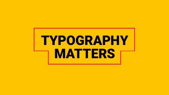
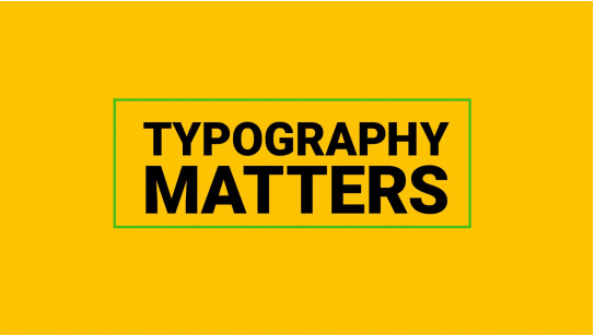
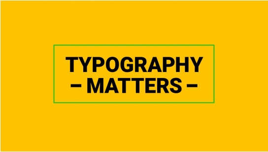
Keeping text aligned in a “box” can be a great way to achieve this, but it can be difficult to keep the text in a
“perfect box” due to the content.
One way to solve for this is to adjust font sizes to "fill in the gaps."
Another is to add elements to fill the space, such as shapes or symbols.
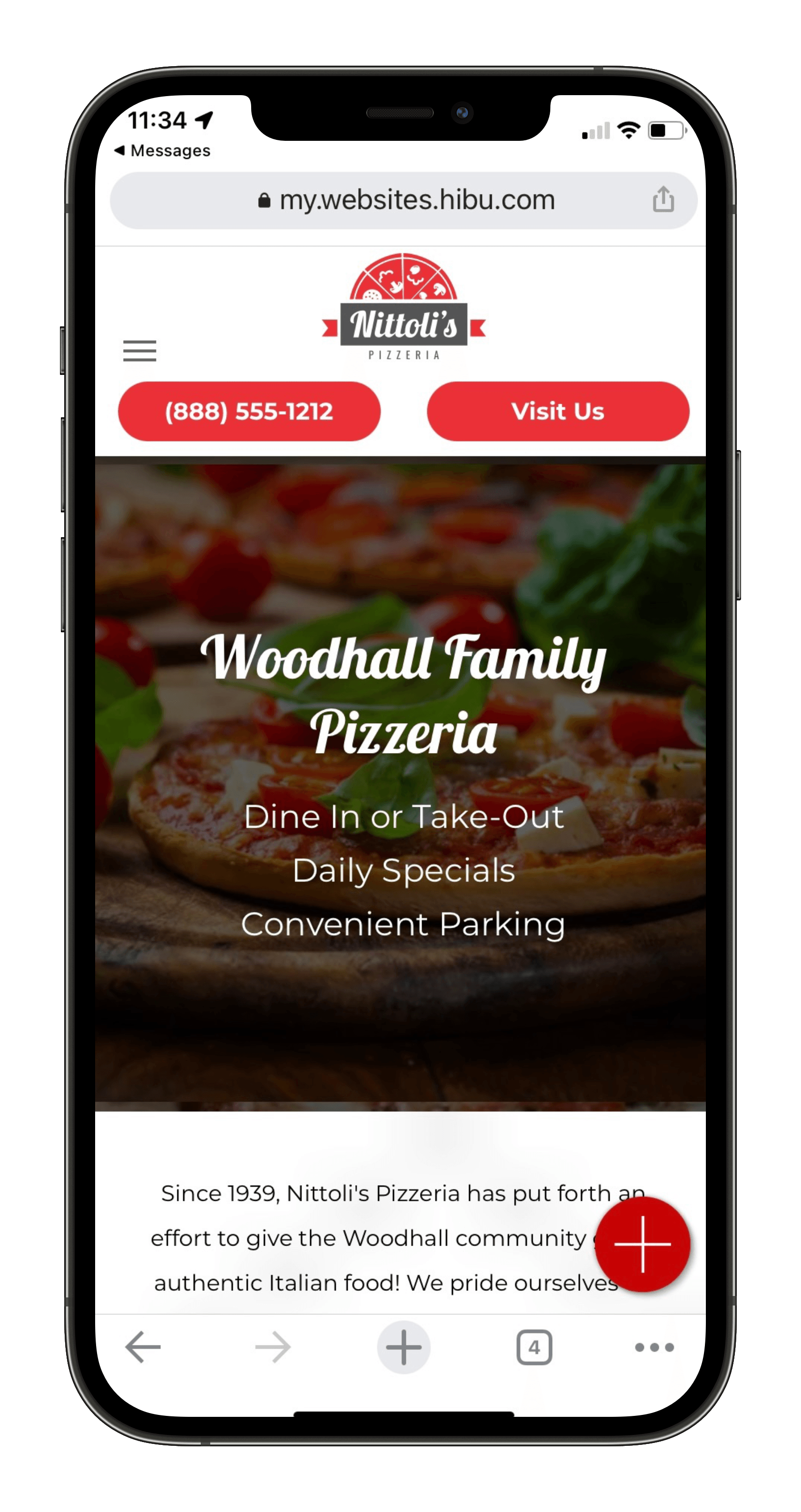
Pairing
When using two different fonts in your design, it is important to consider how they appear together.
Pacifico
&
Cabin
The header text above uses Pacifico, and this body text uses Cabin. Try these fonts out together on your website -- experiment with different sizes, styles, and weights. Harmonizing different fonts together can make your website beautiful!
Jura
&
Open Sans
The header text above uses Jura, and this body text uses Open Sans. Try these fonts out together on your website -- experiment with different sizes, styles, and weights. Harmonizing different fonts together can make your website beautiful!
Find more pairing suggestions at www.google.com/fonts
Hierarchy & Scannability
When using two different fonts in your design, it is important to consider how they appear together.
HIERARCHY Gets people to look where you want them to look, when you want them to look there. Emphasis can be stressed by size, weight, color, style and placement.
SCANNABILITY Allows a user to quickly understand the core features of the business and what they can navigate to next. Using smaller groups of words will help the user pick up the key pieces of information.
Transparency
A fun way to play with headline type is to scale back the transparency to bring out the background image. This works best when the text is short and bold
Eighty
Percent
Contrast
Contrast of the foreground and background colors will greatly improve the readability of your type.
✔
Good Contrast
Poor Contrast
Good Contrast
Poor Contrast
HOME OUR SERVICES CONTACT
HOME OUR SERVICES CONTACT
Text Links
Text Links
The Long Headline
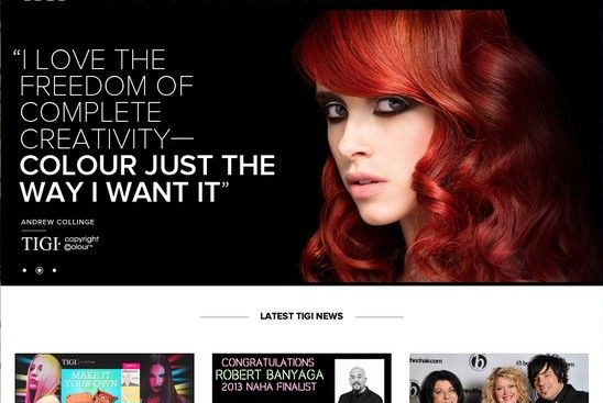
Although the quotation in the hero is quite wordy, the use of a thin font allows the text to work well within the space.
The additional use of a bolder version of the same font attracts the users eye to the key part of the message.
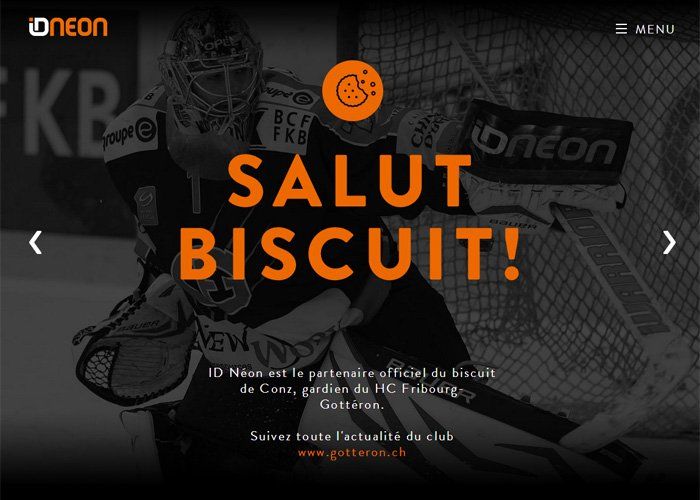
Short and Sweet
This simple approach of using large, bold lettering works well because there are only a few words.
Notice the use of space around the wording which also helps the text to stand out from the rest of the page.
Go Color
The main message really stands out, not only because of the big, bold font but because of the use of color.
The additional supporting text is nicely balanced below and almost mirrors the shape of the text above.
ALL ABOUT ALL CAPS
The combination of using ‘all caps’ in the main message and sentence case in the supporting text works on this example because the typography has been treated to separate the two parts of the message.
Resources
www.pinterest.com/search/pins/?q=typography
I LOVE TYPOGRAPHY
BēHANCE
behance.net/galleries/graphic-design/typography
QOED Magazine
uppercase-sans-serif-typography-in-modern-web-design